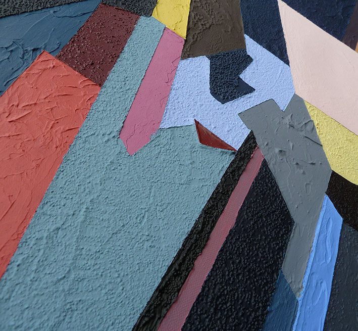
144. Cacophony Kate (Big)
Acrylic and Textural Gels on canvas
100cm x 100cm (104cm x 104cm framed)
£750
Exhibited at the Eagle Gallery 'Five Ways' Sat 19th - Sat 26th November 2022
Exhibited at the Workhouse 'Spring Open' 29th March - 6th May 2023
This is only the second painting I’ve repeated but on a larger scale. The previous occasion was “A touch of Blue” (99) which became “The Butterfly” (115); on that occasion the original was purchased before public display and as I was so proud of the image, I wanted the world to see it so I repainted it, confident a large canvas would merit said image. However, on this occasion, I felt the original was not quite right and so needed another look.
The original and its origins is described in its own page – click on the title of it to link to this page. “Cacophony Kate” (141). The ‘unfinished business’ regarding Cacophony Kate is perhaps that I had not shown the full potential of enlarging this detail. i.e., I could make it larger and the flat glossy varnish didn’t really achieve the “perfect” look which I sort. Indeed, why not do it as a screen print if pure areas of colour are the desired result?
So, with a larger version, I could show an ordered and neat image when viewed at a distance, which on closer inspection has multiple textures – not unlike seeing Florence itself from such vantage points. Not sure I feel I’ve achieved masses with all this work, but I think it’s time to move on.
I had a mind to call the piece “Cacophony: into the multiverse” a title I prefer but I fear it both reflects on my immature tendency to delve into popular culture for my titles and also, I fear “multiverse” is a young word whose meaning has yet to solidify. (Is it a tree of alternate versions of reality as in quantum physics or is it life in a VR game with a headset creating new worlds)
I like this alternate title as it also highlights the non- linear abstraction process. My aged brain failed to remember that I could just use the “Cacophony Kate” (141) as a finished item and scale it up. For some reason, I had to go back to “Cacophony Divided” (116), and scale that up. I grided the one metre canvas and used charcoal to draw in the shapes, then I used greys to define areas then I added texture and colours (masking tape dividing the shapes) and finally painting the whole as a single entity with “Cacophony Kate” propped up as reference.
I certainly made new choices as the small origination I was working from needed interpreting and so new shapes and colours emerged in the process. This is no ‘copynegative’ of a ‘copynegative’ leading to simply less quality than the original. No, this is something different with new variations occurring on route with Florence a long way back in the rear-view mirror. Hence “Into the multiverse” where different actions lead to a new reality.