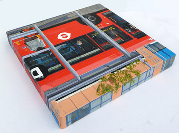
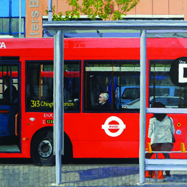
69. Man on a bus
30cm high x 30cm wide
Acrylic on Deep edged canvas
2015
SOLD
Exhibited at Eagle Gallery members show 16th March - 9th April 2015
Exhibited at Hertford Open Exhibition 3rd May - 16th May 2015
Sometimes when out and about, I come across something I feel could inspire a future painting. If possible I try to capture it with my i-phone camera, although this is not always possible (especially when driving) On this occasion I was on foot.
I was walking towards Potters Bar railway station, facing the bus interchange forecourt. It was both the colours and grid like patterns that interested me. I saw a potential flat colour approach in the ilk of “’H’ is for Hospital”. Indeed I thought this might be a sequel to this piece and another in the 30cm square ‘alphabet’ paintings series. “’B’ is for bus stop” or even “’D’ is for bus stop” would be the title.
So I took some photos and stored it away in my brain and on the computer for over a year.
Fancying a picture of this size, I found the canvas from my shelves and searched for the origination. Some time later I found the origination and started composing the picture to fit to a square. This took a little time as I ultimately realised that the composition could not include all the colour and pattern that I would have liked, but should be about the man central on the bus and his relationship to the driver and the lady sat at the bus shelter. The window patterns are not totally lost, however, and as the image wraps around the deep edged canvas they are still visible on the top edge – see below.

These detailed small canvases certainly take a long time, but I’m fairly happy with the result. It has typography spilling off all sides, an interesting relationship of the three figures and a nice lot of red on the canvas too! The image didn’t quite go as flat as I was initially thinking but sometimes things don’t conform to your initial hopes.
When nearing completion, I was luckily in Potters Bar for a final house clearance exercise, and so I had another peek at the scene. This helped me understand that the rear lamp-post tapered to a point upwards; that the shelter had a dirty translucent acrylic roof; the detail of the bus stop sign which was on a pole above the shelter; and that the terracotta accent stone in the side of the building was a square not a circle. I recorded these findings with the help of a few photos. I also recorded the bus destination typography clearer (Luckily a bus going to the same place was sitting in the stop) and the 3 different styles of pavement around the shelter.
Overall, this was quite a painstaking time with riggers, other small brushes and a magnifier. I did feel the precision was worthwhile. I hope that you do too.
|
All Paintings are © Andrew J Naish
Naish Art website © 2023 |
Proudly powered by Weebly
|

